November 25, 2024
7 Essential Elements of High-Impact Home Care PPC Landing Pages
How to design a landing page that converts visitors into leads
PPC ad campaigns are a powerful way to fill your sales pipeline with high-quality in-market leads. But successful campaigns don’t happen by accident.
High-converting campaigns are the result of carefully designed landing pages whose elements are optimized to convert visitors into leads, and leads into customers.
In this article, we’ll outline the most important elements on a landing page, and dive into how the best home care marketers get them right.
What is a PPC landing page?
A PPC landing page is a web page that users reach by clicking on a PPC ad (that’s pay per click). Because you pay only when someone clicks on your ad—not just when it’s displayed—PPC campaigns are an efficient way to drive traffic to your home care website.
These pages are designed to entice visitors to take an action, like providing contact information, scheduling an information session, or making a phone call.
Just like PPC ads themselves, PPC landing pages can (and should) be optimized for converting visitors.
How do you get to a PPC landing page?
Users find your PPC landing pages only by clicking on a PPC ad (on a search engine results page or social media platform), they cannot be found by clicking around your website.

7 essential elements of a great home care PPC landing page
So, how do you get a PPC landing page right? There are seven essential elements of every effective landing page.
1. A purposeful headline and kicker
A headline tells your visitors right away whether they’ve come to the right place. Do you provide home care? Can you meet their needs? Note that those needs may be clearly indicated in their search query (like home hospice care).
A kicker, or a subhead, should build upon the headline and indicate your expertise in home care.
2. Your home care agency’s name and logo
Right away, start building brand recognition. Your home care agency’s name and logo should appear at the top of the page. Even if they don’t convert the first time they visit your page, knowing your name could lead to a conversion later.
3. Meaningful copy that reflects their search query
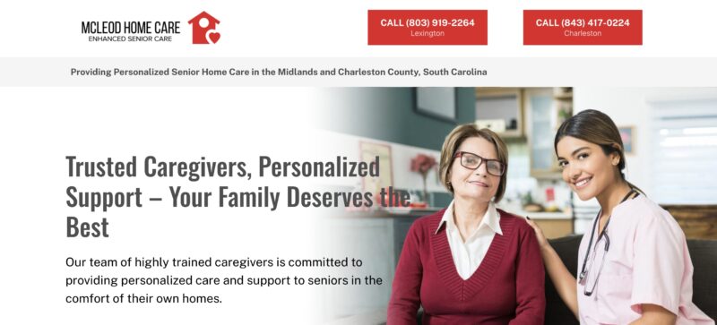
Show users that you’re able to provide what they’re looking for. For example, if they searched for home care near me, your website should identify your service area right away. Take, for example, the below landing page, which indicates in several places that the agency services the Happy Valley, Pennsylvania, area.
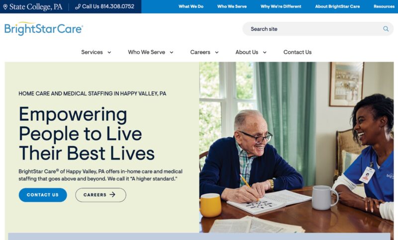
TIP: Don’t worry about showing up in search results of someone who’s looking for home care outside your service area—PPC campaigns can be hyper-targeted by location so you don’t risk ad waste.
Consider also that some in-market searchers are concerned about cost, and may indicate it in their search query. For a landing page aimed at those worried about affording home care, address those concerns.
4. High-quality images or illustrations
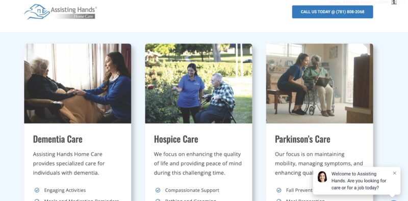
Your landing page should include more than just text. Use engaging, high-resolution images or illustrations. Ideally, original elements rather than stock images. (But a well-chosen stock image can be just fine.) In the images below, the caregivers' uniforms are embroidered with the agency’s logo.
5. Trust signals
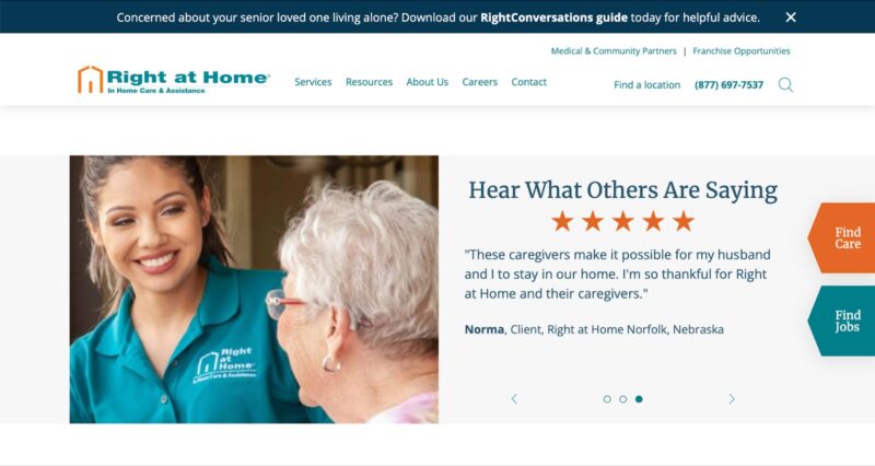
The people who arrive at your home care PPC landing page may not have heard of your home care agency, so why should they trust you? Trust signals include:
- A high-quality landing page with professional images
- Testimonials and endorsements from current clients (Don’t have any yet? Check out our tips for requesting reviews from your clients.)
- Awards and credentials
- Your success record
- Years of service in your area
6. Call to action
The call to action, or CTA, is arguably the most important part of your home care PPC landing page. Pick a single action you want users to take—too many options can mean they take none at all. Users should be able to take this action right on the page, above the fold. Don’t make them scroll, send them elsewhere, or require them to jump through too many hoops.
The very simple landing page below makes it clear what action it wants visitors to take: Enter their location to find caregiving options close by. The page features simple, cheerful images and a singular call to action in the center, plus a phone number in the top right corner in case the visitor wants to speak to a person.

7. Another way to contact you
Even if you want visitors to enter their contact information, give users a way to get in touch with you directly and on their terms. A phone number at the top of the page is often very effective and is the preferred method of contact for many potential clients.
These are dynamic phone numbers that can be used to track which pages are most likely to result in a phone call. To maximize your chances of converting inbound callers to clients, prepare your team with phone scripts.
7 tips for building a high-converting landing page
- Identify your campaign goal: The most successful PPC campaigns start with a clearly defined goal. Yours might be generating qualified leads by collecting contact information or getting in-market leads to call your agency directly. You might have other goals, like brand awareness or casting your agency as an affordable choice in your area. Choose a single goal and design toward that goal.
- Use recognizable branding: Your PPC landing page should resemble your home care website in style, layout, colors, and fonts. Not only is it easier to spin up a page based on existing branding, but it will also help build brand recognition.
- A/B test your pages: The wonderful thing about home care PPC ad campaigns is that nearly every element can be varied and tested to find the most optimal combinations. This is very important for landing pages. For instance, you could test button colors, calls to action, headlines, lead generation forms, and images to find which combination yields the best results. Vary only one element at a time to create test and control environments; otherwise it will be tough to identify the winning change.
- Try them out yourself: Play the role of a potential customer and engage with your own landing page. Ask a colleague or friend who’s never seen the page before to use it—do they know what action they’re meant to take? Do they get the information they’re looking for?
- Don’t overload your pages: Landing pages with lots of text, colors, images, and buttons are distracting and overwhelming. Make yours as clear as possible: Meet their needs early, earn their trust, and minimize the directions your visitors can travel by funneling them toward your CTA.
- Prioritize page speed: Not only does a fast page speed reduce the chances that users will bounce away from your landing page and back to the SERPs, it also makes it more likely that your ads will be displayed above your competitors’ ads.
- Optimize for mobile: More than two-thirds of internet searches are made on mobile devices, so your landing pages should be optimized to capture those users. Think of it this way: Your next client may be sitting in a hospital, trying to find home care for their family member who’s headed home in the morning. If your pages are optimized for mobile, that client might be yours.
Build home care PPC landing pages that convert
At Home Care Marketing Pros, we design all of our tech with conversion in mind to help home care agencies build their businesses—and thrive. Our Pay-Per-Click Advertising service will get your home care PPC campaigns up and running in no time. Book a demo and we’ll show you how.


