Have you ever come across a website that looks beautiful at first, but is nearly impossible to use?
When it comes to websites for home care, functionality and graphic design go hand-in-hand to create positive (or negative) experiences for your users.
Great usability is all about creating great experiences. Here are some usability guidelines you should be implementing in your own website:
- Know your audience.
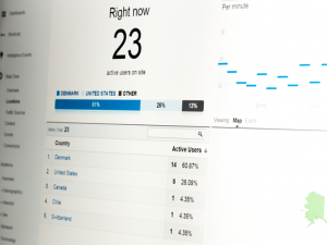
Determine who is coming to your site, and how. Is your audience primarily job seekers in their early 20’s or family members of prospective home care clients in their late 60’s? Is the majority of your traffic on a desktop computer or a mobile device? Are visitors coming to your homepage from a search engine, or do most arrive through blog posts that were shared through a social media site? Thinking about all of your potential visitors will let you optimize your website for specific audiences and devices. Installing and understanding analytics on your site is a great first step in determining your website’s traffic sources. - Have a clear purpose.
Each page or section on your site can serve one primary purpose. For example, a “Contact Us” page should provide the user with an easy way to get in touch with you. Make sure you’re including a simple contact form, or at the very least, your address and phone number. In general, too much content on a page can be overwhelming. Make sure all of the content and imagery on a page successfully supports or complements the main objective. - Keep copy clear and concise.
When you’re looking for specific information on a web page, you probably don’t want to read a novel to find it. Instead, users quickly scan web pages to find the information they’re looking for. Getting straight to the point within the first paragraph or two is crucial. A rule of thumb when writing for the web: draft a first copy, cut that in half, then convert to bullet points where possible! If you’re having trouble cutting down copy, consider adding visual clues like images, charts and graphs, or bullet points to make the information easier to digest. - Add clear calls to action.
Take a look at any web site. What do you see first? Second? Most likely, your eye first goes to images, buttons and headlines before smaller copy. Controlling this “hierarchy of visual information” is crucial to great usability, and can be accomplished in many ways. Size, placement, contrast and color should all be considered when designing your calls to action. When it comes to copy, keep it clear and concise. The user typically wants to know what to expect when he/she clicks a button. For example, “Schedule a Consultation” is a better action item than “Begin the Process”.
Imagine you are looking for information on roasting pans, and you come across the following articles. Which article is easier to find the information you’re looking for?
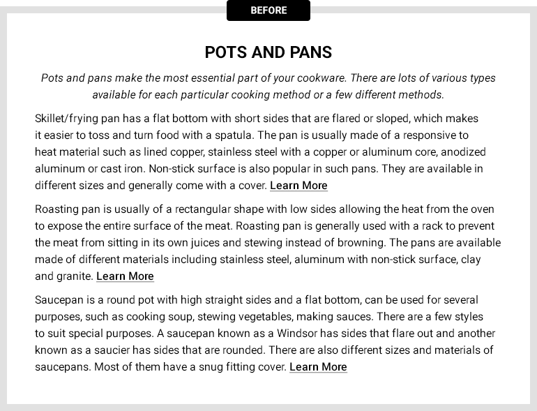
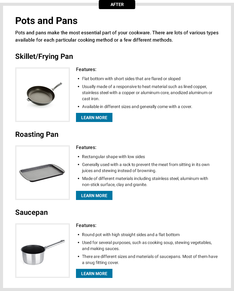
The second article is easier to scan because of it’s use of imagery, bullet points, variation in font sizes and weights, and contrasting calls to action.
- Optimize Everything on your site for mobile devices.
As you’ve probably heard, responsive websites are important. A responsive website is one that adjusts both the design and content of a site to fit the size and purpose of different devices. Mobile traffic is on the rise, and having a mobile optimized website is critical. Keep in mind though that everything on your website should be mobile optimized. This includes features like requesting care, your job board and contact forms. You might have a clean mobile site that’s easy to navigate, but if a potential home care client is taken to a form that breaks, is hard to read, or has an incredibly long process, you will probably lose that client.
Consider all of these guidelines when creating a new page on your own website. Great usability is key to achieving the conversions you’re after. If you think your website could use some usability upgrades, or you’re not sure where to start, request a free home care website and marketing assessment.


