Making Every Click Count: The Importance of Intuitive Design in Home Care Websites
How to streamline the customer experience at one of the earliest points of contact
One of the first places a potential client will interact with your home care agency is your website. How much thought have you put into making it conversion-optimized? That is, designed in a way that makes it as quick and easy as possible for leads to become clients?
Unless your website is intuitive, you can easily lose potential leads when they can’t get the info they need right away.
Conversion-optimization requires intuitive design—and it’s the foundation of great home care websites.
What does intuitive design mean?
Intuitive design is simply the act of making things easy to use. It’s important that home care websites adopt intuitive design principles to convert clients quickly and with as little friction as possible.
At the center of intuitive design is the customer experience, which encompasses every touchpoint that clients—and potential clients—have with your home care agency. The customer experience begins long before anyone ever signs a service agreement with your business.
4 characteristics of intuitive design
One of the first contacts your clients have with your agency will be your home care website. These four characteristics will reduce visitor friction and encourage visitors to convert into client leads.
- Invisibility: Intuitive design is unnoticeable. Users who arrive at your website won’t necessarily be thinking about its design, they’ll only be happy to quickly get to what they’re looking for.
- Navigability: Intuitively designed websites require as few clicks as possible to reach a destination. This means they have simple navigation menus; clearly labeled pages, content, and buttons; and a shallow organizational structure. Anything a client lead might want to do or learn should be only a few clicks away.
- Contactability: One of the most important features of intuitive design is a quick way to contact your home care agency. Best practice is to include a click-to-call button and a visible phone number “above the fold.” That is, visible as soon as the webpage loads, no scrolling necessary.
- Conversion-optimized: Having an easy way to contact your agency is the cornerstone of conversion optimization, but there’s so much more: it requires pleasing colors, smart organization of information, carefully-planned lead generation forms, and pleasing design. This art is known as conversion rate optimization (or CRO), and it requires A/B testing as well as trial and error.
What about out-of-the-box template sites?
Many small and medium-sized businesses opt for websites built on platforms like Squarespace and Wix, which offer out-of-the-box templates that can be customized to your business’s needs.
These tools are very handy for getting an attractive, professional-looking website up and running quickly, and generally, they’re a solid place to start.
But right out of the box, these sites aren’t optimized for conversion, and they don’t make it easy for business owners to adapt the design to their changing needs. And perhaps most importantly, CRO varies by industry:
- What works for product retailers, for instance, won’t work for home care providers, and those tools don’t always make a distinction.
- Your website design should be tested and rely on proven processes to find the optimal mix of messaging, buttons, colors, and organization, and this requires the ability to manipulate all elements easily.
6 tips for optimizing your website
When applying intuitive design to your website, ask yourself:
- What do my clients want to know?
- How can I make it easy for them to get in touch?
Here are a few tips for satisfying client needs on your home care website home page:
1. Include a phone number highlighted above the fold, and make sure it’s click-to-call enabled.
2. Feature client reviews so you can start establishing trust right away.
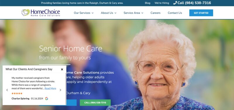
3. Add a chat function, which can increase visitor engagement and help you capture in-market leads.
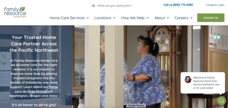
4. Include highly visible navigation buttons to engage visitors quickly and help them self-qualify on their customer journey.
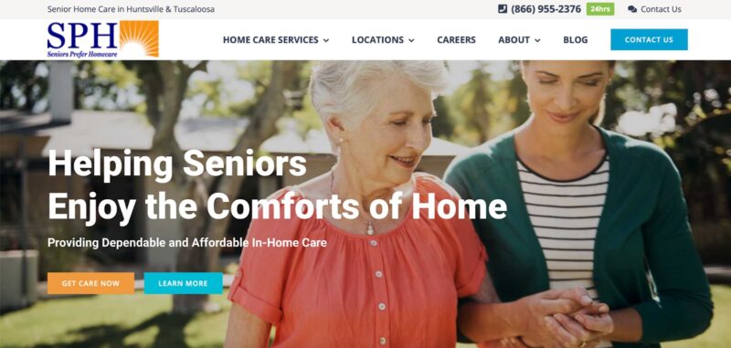
5. Outline your services so visitors can see at a glance whether you can meet their needs. If you’re not the right fit, they can self-select out, saving time on both sides.
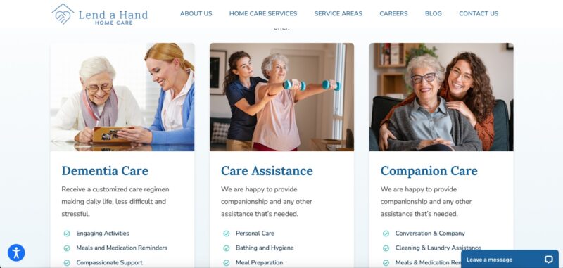
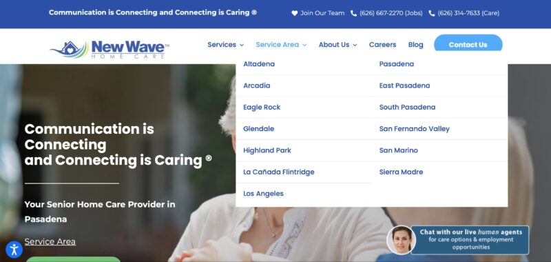
6. Include important information in drop-down menus to avoid cluttering your home page. By categorizing need-to-know info, like services areas and service types, you can help visitors get the info they need without ever leaving your home page.
Making home care websites intuitive
At Home Care Marketing Pros, we build websites that are intuitive and conversion-optimized so you can make them most out of every click. Our design team can help you create a website with your ideal clients in mind. Get in touch to learn more.


